Someone, I forget who, mentioned the book Art and Fear by David Bayles and Ted Orland. It is packed with gems, and funny to boot. Of course I promptly bought it for Sonny Jim, the diffident artist, but he already has a copy (unread), so now I have a copy too. I'm liking what I'm reading. Here's a piece of gold:
People who produce art (quilts) are people who have learned not to quit.
Quitting is easy. Just ask my basket of unfinished projects. The illusion that the next project will work out perfectly will eventually drive you to drink, or chocolate, as it consistently proven to be false! If you want to produce a quilt, particularly an art quilt, you have to learn how not to quit. Quitting is not the only way out. Try to have a catalog of strategies for those moments when you can't believe how much you hate something you have expended so much time, energy and hard-earned cash on:
a. Ask for advice! One of our most talented guild members brought in a quilt she felt wasn't working. One piece of advice was to rotate the quilt. Voila, it no longer felt unbalanced, and was pronounced very good! Fresh eyes and different ideas can make a big difference.
b. Hang it somewhere your eye will light on it unexpectedly. It may suddenly be obvious that you need a different shade of green, or that the perspective is off, or the focal point needs to be strengthened. You may already know how to fix it, you just need some distance. Putting it away for a week or two helps get some perspective too. When you look at it again, you may feel differently.
c. I have a bazillion books on design etc. but I never take the time to make myself an emergency checklist. It would be helpful to go
focal point - check
contrast - check etc.
Next week maybe I will get as far as chapter two!
Wednesday, October 28, 2015
Sunday, October 25, 2015
Running out of steam
I did a great class with Nancy Smith on Craftsy, called Strip your stash. Strips I can do. Piecing anything very intricate is not for me. I don't have the patience, nor the accuracy. Quick and colorful does me nicely. I can't even cut straight with a rotary cutter. My Accuquilt is my saving grace!
 So I dyed lots of fabric, some batik work, some shibori, some LWI.

Then I made about a bajillion strips, and was off to the races, stripping up some quilts to go with my Jane LaFazio cushions.
 #1 - Although it is hanging crooked off a chair, the rows are actually straight lines. I love the fractured look. And I love that it wasn't difficult to do. Cut strips. Sew them together. I can do that.
 #2 - The illusion begins. I start to think I can piece. Squares are just strips cut short right?
 #3 - Accuquilt also has flying geese cutters, which helps me enough that I don't cut off too many of the geese's noses sewing them together. So much more time-consuming than the strips though!
 #4 - I finally come unstuck. Triangles from strips reveal all my slapdashitude. I love the look, but when I sew the first 2 pieces together it becomes clear that accuracy is sorely missing. Triangles are tricksy little things. They stretch, they unravel, they have points. They demand actual piecing skills. Things have to meet. They don't.
I had intended to make 4 lap quilts. I had romantic illusions of the family snuggling around the fire at Christmas. 3 quilts are made, bound and in service. Number 4 languishes on my design wall, glaring at me reproachfully as I start new projects. Sadly, this project is done in my head, even though it still clutters up my sewing room. Maybe it was too ambitious to do so many quilts at one time. I got bored. I got beyond my competency level. Maybe I'll finish #4 some time in the future. But I wouldn't hold my breath...
#4 will be consigned to the BUP - basket of unfinished projects. This is a limbo where things sit until sufficient time has passed that I can admit that they will never be finished. At that point they are quietly dismembered, and the corpses disposed of inside pillows for homeless animals.
In the mean time I have 3 colorful quilts, nicely folded and ready for family snuggles.
 Ahem, Ms. Thambile, those were not intended for you to shed all over. She is the original princess and the pea. Why sit on one cushion, when you could sit on a pile of quilts?


Then I made about a bajillion strips, and was off to the races, stripping up some quilts to go with my Jane LaFazio cushions.


I had intended to make 4 lap quilts. I had romantic illusions of the family snuggling around the fire at Christmas. 3 quilts are made, bound and in service. Number 4 languishes on my design wall, glaring at me reproachfully as I start new projects. Sadly, this project is done in my head, even though it still clutters up my sewing room. Maybe it was too ambitious to do so many quilts at one time. I got bored. I got beyond my competency level. Maybe I'll finish #4 some time in the future. But I wouldn't hold my breath...
#4 will be consigned to the BUP - basket of unfinished projects. This is a limbo where things sit until sufficient time has passed that I can admit that they will never be finished. At that point they are quietly dismembered, and the corpses disposed of inside pillows for homeless animals.
In the mean time I have 3 colorful quilts, nicely folded and ready for family snuggles.


Wednesday, October 21, 2015
Wednesday words
Courtesy of Leah Day: "having cool supplies does not make you a creative person!"
So true! I have a bad habit of seeing a cool new technique or product, getting the supplies, and then never getting around to using them. I am going on a long flight soon, and that always makes me think of how my poor husband would probably want to set my studio on fire if something happened to me - there is so muchjunk unrealized treasure in there!
Consequently, I have spent the past two weeks busting through my stash of test colors of hand dyes. It is a lot of fun to try different quilt patterns, and to try to bring out the beauty of the fabric, while still making something useful. I am making crib size quilts to donate, not too big, so I can practice FMQ on them without wanting to climb the walls.
If When I get back I plan to get creative with the rest of my cool supplies!
So true! I have a bad habit of seeing a cool new technique or product, getting the supplies, and then never getting around to using them. I am going on a long flight soon, and that always makes me think of how my poor husband would probably want to set my studio on fire if something happened to me - there is so much
Consequently, I have spent the past two weeks busting through my stash of test colors of hand dyes. It is a lot of fun to try different quilt patterns, and to try to bring out the beauty of the fabric, while still making something useful. I am making crib size quilts to donate, not too big, so I can practice FMQ on them without wanting to climb the walls.
Monday, October 19, 2015
Overdyeing experiments - part 3 - some fabric pics at last
My goal in overdyeing fabric was to create more nuanced colors which I would like to explore further in various ways. I am mostly drawn to clear bright colors, so this wasn't an exercise in exploring neutrals. However, there is definitely a place for more subtle colors and neutrals. Helen Terry has some great posts on neutrals overdyeing experiments with complementary colors, and she has some truly lovely results.
My experiments are not rocket science, nor do they produce startling new information, but I find it helpful to document what I find as I experiment with Procion MX dye, and perhaps some other new dyers will too. Here are the conclusions I drew from this exercise:
1. It's all about proportion. Mud is not a foregone conclusion whenever the 3 primaries meet. There were some complementary mixtures which made pleasing colors where the proportions were not 1:1.
Two perfectly pleasant greens (top) which become extremely ick when the overdye contained too much red (bottom). Trust me, this photo is flattering those overdyes. They are butt ugly.
2. To my taste there are more positive results when the base range is analogous to the overdye.
Teal and pink overdyes (bottom) are not strictly speaking analogous, but far enough from complement to produce some very pleasant colors.
3. The overdye which was successful across the greatest range of base colors was a pure blue. Further tests needed to determine if this was because it was blue, or because it was not a mixture. All the other overdyes were mixtures of pure colors (except the dirty green, which had grey). Almost all the base colors were mixtures of pure colors.
However, even in mixtures the blue played nice. This medium blue (left) is a mixture of 4 different colors, overdyed with indigo (red and blue), on the right. The base blue makes for some lighter pops of color creating a nice varied result.
4. When working with mixtures it is really important to keep in mind what makes up the mixture in order to have a successful overdye. Green made from blue and yellow will introduce very different elements than a green made from yellow and black.
5. Grey is a whole other ball game. There is a new pure grey that has just been manufactured, but this isn't it. This is a grey that tends to green. That means it is great with the blues and greens and teals, but turns pinks and purples a dull brownish mauve. From left to right, orange and grey - an interesting mushroom; teal and grey - never met a teal I didn't like; red and grey - unappetizing brownish mauve. Looking forward to testing with the new grey to be able to grey things without adding unintentional elements into the mix.
6. Overdyeing can rescue an obnoxious base color. Here the base color was a lime that would set your teeth on edge (bottom). Overdyed with teal (top), it becomes a much more likeable sour apple green, still with hints of lime to give it interest.
7. The
respective strength of the base color and the overdye will have a big
influence on the results. I dyed the base color at 4% OWG (left) and at 8% OWG (right).
The overdye was at around 2% OWG. Remember the covalent bonds? An 8%
dyestock uses up a lot of the available dye sites on the fabric, so the overdye was much less obvious. Some of the overdyes
were made to a much weaker concentration than others. I was afraid the
indigo would overwhelm if I made it too strong. The pink and dirty green
were also very dilute. Where these overdyes were layered over colors
similar to themselves, they barely registered.

On the 4% piece (left) you can see the mottled look created by dye sites which are not completely full. This is particularly obvious when you dye with the low water immersion method. This red was overdyed with a dilute dirty green made of yellow and grey. On the 8% sample there are barely any overdye marks (bottom right). On the 4% sample there are some interesting greeny/grey marks (bottom left).
Even more dramatic is the indigo overdye.
 The 4% solution (left) allows for a strong indigo overtone in the overdye (bottom left). On the sample dyed at 8% (right) there are only traces of indigo by itself in the overdye (bottom right), although the base color has darkened considerably.
One last point is the fabric used. Because I planned to dye so much, I went cheap and used my Joann's coupon to buy the Premium Legacy muslin. This is not mercerized, and gets a fuzzy look after a tough dye workout. If I had used mercerized print cloth, I would have had brighter results.
Lots more questions to answer! To the dye pots for more experiments!!
My experiments are not rocket science, nor do they produce startling new information, but I find it helpful to document what I find as I experiment with Procion MX dye, and perhaps some other new dyers will too. Here are the conclusions I drew from this exercise:
1. It's all about proportion. Mud is not a foregone conclusion whenever the 3 primaries meet. There were some complementary mixtures which made pleasing colors where the proportions were not 1:1.
 |
| Base green/overdye red = ick |
2. To my taste there are more positive results when the base range is analogous to the overdye.
 |
| Base yellow/overdye analogous = all good results |
3. The overdye which was successful across the greatest range of base colors was a pure blue. Further tests needed to determine if this was because it was blue, or because it was not a mixture. All the other overdyes were mixtures of pure colors (except the dirty green, which had grey). Almost all the base colors were mixtures of pure colors.
 |
| Blue overdyed with indigo |
4. When working with mixtures it is really important to keep in mind what makes up the mixture in order to have a successful overdye. Green made from blue and yellow will introduce very different elements than a green made from yellow and black.
 |
| Overdye surprise! |
These little pops of turquoise are not turquoise dye, but blue overdye reacting with the yellow which separated out in the red mixture. The result makes for some stunning pops of unexpected contrast.
5. Grey is a whole other ball game. There is a new pure grey that has just been manufactured, but this isn't it. This is a grey that tends to green. That means it is great with the blues and greens and teals, but turns pinks and purples a dull brownish mauve. From left to right, orange and grey - an interesting mushroom; teal and grey - never met a teal I didn't like; red and grey - unappetizing brownish mauve. Looking forward to testing with the new grey to be able to grey things without adding unintentional elements into the mix.
 |
| Grey overdyed |
 |
| Lime green overdyed with teal |

On the 4% piece (left) you can see the mottled look created by dye sites which are not completely full. This is particularly obvious when you dye with the low water immersion method. This red was overdyed with a dilute dirty green made of yellow and grey. On the 8% sample there are barely any overdye marks (bottom right). On the 4% sample there are some interesting greeny/grey marks (bottom left).
Even more dramatic is the indigo overdye.

One last point is the fabric used. Because I planned to dye so much, I went cheap and used my Joann's coupon to buy the Premium Legacy muslin. This is not mercerized, and gets a fuzzy look after a tough dye workout. If I had used mercerized print cloth, I would have had brighter results.
Lots more questions to answer! To the dye pots for more experiments!!
Wednesday, October 14, 2015
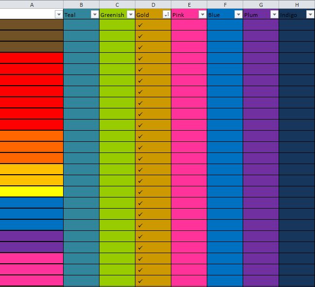
Procion MX overdye results - part 2 - Excel-ish
The first check mark below in cell B2 is a red base color overdyed with teal; the second check mark in cell B3 is an orange base color overdyed with teal; the third check mark in cell B4 is a yellow base overdyed with teal, etc. etc. Each base color had been washed out fully and then re-soda soaked, so the results don't reflect wet colors mixing, but a true overdye of a previously completed dye job, utilizing the transparency of Procion MX dyes to create interesting new colors.

Teal overdye results
Teal is a mixture of yellow and turquoise. As expected, where the teal overdye hits a base color with a high proportion of red, ick ensues. Very few red and orange colors made the cut below. Yellows also pushed the teal too far to green for my taste. Pinks and purples, being made up of less red, created some pleasant colors. Lots of analogous hits.
 |
| Teal overdye |
The results were a complete surprise. I did not expect to have so many hits with red with a green overdye, but I had forgotten that this green had no blue in it. It was a yellow/black mixture. No blue meant no ick.
 |
| Green overdye |
Clearly the gold did not play nice with the greens, or else I only like a very specific kind of bright happy green, not so much the sludgy/khaki/camo. The gold had red in it. Go figure!
 |
| Gold overdye |
The pink was heavily diluted and so often failed to make much impact on the reds or purples and it was quite unpleasant with the browns. Pink is a watered down version of red and yellow so very limited green hits below as might be expected. My grey had green in it, so more ick ensued with pink overdye there too.
 |
| Pink overdye |
Blues are real team players. Probably the best range of good results across the other colors. This was a pure color overdye, so nothing to split, unlike all the others. And such good across the board results, hmmm. Something to ponder there. More experimentation required!
 |
| Blue overdye |
Well goodbye yellow! And brown..And green...The plum was a mixture of red and blue, so any base color with a large proportion of yellow in the mix tipped it right into ick territory. Lots of positive orange results where the concentration of yellow wasn't so strong.
 |
| Plum overdye |
Again, indigo is a blue/red mixture, so the yellows don't play nice, but the oranges are not too bad, and the depth of the indigo makes it stand out well against the blues.
 |
| Indigo overdye |
In the next post I will show some fabric samples and try to draw some conclusions.
Saturday, October 10, 2015
Procion MX overdyeing fabric - results part 1 - getting all sciency(ish)
Dyeing with Procion MX is so stable and successful because it is a fiber reactive dye, which means there is a chemical reaction between the fabric and the dye which creates a very strong bond. Unlike paint, that sits on the surface of the fabric, the dye forms a covalent bond with the fabric. If you want a good scientific explanation relating to Procion MX, go here.
If you want a quick word picture here it is (I can imagine my daughter, the chemist, rolling her eyes..): picture the fabric with lots and lots of cute little hands, fingers waving in the air. Make sure your mental picture is cute, or it starts to look like a horror movie - zombie fabric is coming to get you, run! Now imagine your dye stock also has lots and lots of cute little hands, fingers waving in the liquid.

When the dye stock meets the fabric, the hands reach out to one another and the fingers intertwine, making bonds between the fabric and the dye. The number of hands (technically dye sites) on the fabric depends on the type of fabric you have chosen. The number of hands in the dye stock depends on the strength you have mixed, i.e. the ratio of dye powder to water. While you can bump up the ratio of dye to water, after a certain point you are just wasting dye because the number of dye sites on the fabric is the limiting factor. After all the dye sites are filled, there is no way additional dye can react with the fiber and it will just wash out and down the drain.
This is important for overdyeing. If all the hands on the fabric are already holding corresponding dye stock hands, the overdye color will have no impact. However, if you have used a diluted dye stock for your first dye, there will still be fabric hands without dye partners and they will reach out and grab the dye hands of the second dye stock.
Now I have to step away from my analogy for a moment to point out that dye is transparent. Unlike paint, which covers your first color, dye will not completely mask your first color. Moreover, the base color will influence the second color.
It sometimes gets confusing when people talk about overdyeing. Some people use overdyeing to mean dyeing a value gradient from light to dark, or dyeing a mixture of two colors from pure color A through increasing amounts of color B till the last color is just pure color B. However, what I am doing here is dyeing and washing out a base color, then dyeing a second color over the first base color.
Next post: analyzing the results of my experiments.
 |
| Overdyed fabric |
When the dye stock meets the fabric, the hands reach out to one another and the fingers intertwine, making bonds between the fabric and the dye. The number of hands (technically dye sites) on the fabric depends on the type of fabric you have chosen. The number of hands in the dye stock depends on the strength you have mixed, i.e. the ratio of dye powder to water. While you can bump up the ratio of dye to water, after a certain point you are just wasting dye because the number of dye sites on the fabric is the limiting factor. After all the dye sites are filled, there is no way additional dye can react with the fiber and it will just wash out and down the drain.
 |
| Overdyed fabric |
 |
| Diluted base colors overdyed |
 |
| Neutral overdye |
Next post: analyzing the results of my experiments.
Sunday, October 4, 2015
Preparing to overdye with Procion MX
Remember these?

These were some of my favorite colors ready to be overdyed.
Each of these was a fat quarter, which was then torn into 8 pieces, 1 original color to keep for comparison, and 7 to be overdyed with various other combinations.
 1/8th of each color scrunched into a wallpaper tray
 Overdye color poured on. Panic sets in, is this a big waste of time? Will the results just be a homogeneous mess? to be continued...


These were some of my favorite colors ready to be overdyed.
Each of these was a fat quarter, which was then torn into 8 pieces, 1 original color to keep for comparison, and 7 to be overdyed with various other combinations.


Friday, October 2, 2015
Consistent color in dye results with Procion MX (good luck with that)
So here's a list of factors that have to be consistent to get the same dye results over and over with Procion MX (and I'm sure I've missed a number of others - feel free to add in the comments). Some of them are more critical than others, but it sure gives you a new respect for folks who can recreate the same colors over and over again.
The list encompasses all the elements of dyeing. Change one of these elements between dye sessions and you might find your colors change, maybe subtly, maybe dramatically.
Fabric
Each dyer finds his or her own best practices. Keeping notes helps remind you what you did, especially during a hectic dyeing session.
The list encompasses all the elements of dyeing. Change one of these elements between dye sessions and you might find your colors change, maybe subtly, maybe dramatically.
Fabric
- Mercerized or not?
- The same weight?
- The same type?
- PFD? Scoured?
- Wet or dry?
- Fabric pre-soaked?
- Added with dye?
- Added after the fabric has sat in the dye for a bit? How long?
- How old is it?
- How accurately does your scale measure?
- Did you strain colors that are known to freckle?
- What was the temperature of the water used to make the dye stock?
- Did you use the same measuring utensils?
- How did you mix the dye stock? blender? shaking the bottle?
- How old is the dye stock?
- If it isn't fresh, how was it stored?
- What strength is it?
- Did it come into contact with any soda ash?
- How hard is your water? Did you add metaphos?
- Did you add urea?
- How aggressively did you manipulate the fabric?
- How many times did you manipulate the fabric during the batching process?
- Some dyes settle out easily. Did you stir the dye stock before adding to the fabric?
- How did you arrange the fabric in the container?
- Did you use the same sized containers?
- Did you add salt?
- What was the ambient temperature during batching?
- How much liquid was in the container during batching?
- How long did you batch for?
- Was the batching fabric pressed down or free floating?
Each dyer finds his or her own best practices. Keeping notes helps remind you what you did, especially during a hectic dyeing session.
Subscribe to:
Posts (Atom)